Sketchbook pages containing my ideas for a CD cover design. This included all the art work for the CD; front, back, spine, inside and the CD.
Sunday, 30 December 2012
Poem Project Finals
After having a crit on this project I decided I wanted to improve these further and in one case re-drew/re-painted an illustration because I wasn't happy with the outcome.
Poems Project
Sketchbook work of idea development for four different poems
The Tiger by William Blake
The Little White Road by Thora Stowell
Batty by Shel Silverstein
Polar Bears by William Jay Smith
The Tiger by William Blake
The Little White Road by Thora Stowell
Batty by Shel Silverstein
Polar Bears by William Jay Smith
Tuesday, 30 October 2012
Some more doodles for The Wind in the Willows book cover. Just trying to work out the composition and how I want it to look.
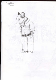
The start of character development on Ratty. Taking inspiration from the animation.
Rough experimentation on how I want the cover to look. Might try mono printing leaves or leaf rubbings instead.
Tuesday, 23 October 2012
The Wind in the Willows cartoon animation
I watched the 1995 animation to get some ideas for The Wind in the Willows book cover. This has given me a greater sense of the story line.
Monday, 22 October 2012
The Wind In The Willows
Getting ideas and research written down in my sketchbook for The Wind in the Willows.
Mainly from watching the 1995 animation and background information on the story.
Some image research that has been very inspiring to look at and I included these in my sketchbook too.
Again some more image research mainly from the 1995 animation.
Lastly is a rough ideas sketch I had of all the main characters in a old car with crazy Mr Toad driving it.
Guardian Front Cover Revised
I was able to revisit the Guardian and make a few changes, such as add colour to the match and darkening the background to black rather than a dark blue. So here is the final image.
Thursday, 11 October 2012
Guardian Weekend Front Cover
Eeek! first blog post.
I was given a brief at uni to create a front cover for the Guardian weekend.
There were two themes one being climate change, which I picked.
This piece is basically the earth as a match on fire, I didn't want the earth to be round or globe like at all,
I wanted it to be uneven and square in shape to show the deterioration of the earth.
I hand drew the match on layout paper using fine liners in different thicknesses.
I then scanned that black and white image into photoshop so that I could create the flame.
The flame was quite hard to draw and to make it appear real, I looked at many image to get it right. Lots of different colours of blue, purple, yellow, red and orange and a lots of blending until I was happy with the outcome. I have decided I want to try and rework it, maybe add a texture of colour onto the wooden part of the match.
Subscribe to:
Comments (Atom)


